
Have you ever had several times to re-read the text to understand its essence? This problem is probably familiar to all — as a student, faced each. Researchers from Royal Melbourne University teamed with a local design school and have tried to solve this problem. Paradoxically, the best remember what we have read of the text contributes to the difficult to read font.
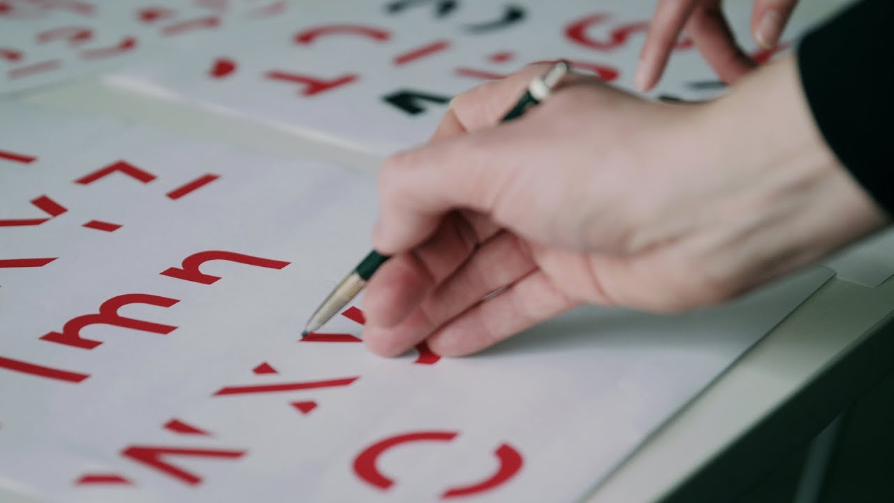
Researchers and designers created it. He was named Sans Forgetica, and its main feature was the absence of some parts of the letters. According to the authors, this appearance of the characters encourages the brain to engage in deeper study of the text, thus forcing better remember it.
The brain will naturally try to paint the shapes of the characters. So, by doing this, it will slow down the reading, which subsequently will improve memorization — explained the teacher printing the Stephen Banham.
The drawing of the missing fragments of the letters takes just a fraction of a second, but the method, according to the results of the experiment really works.

To test the effectiveness study was conducted, which involved 400 students. They were divided into two groups and gave a reading two versions of the same text: one written font Sans Forgetica, and the other is Arial. The text is printed font Sans Forgetica remembered by the students, 57%, whereas the text with the font Arial only 50%.
Professor Stephen Banham believes that Sans Forgetica is only suitable for short texts:
Would you like to have this font was printed books. It would have definitely caused headaches.
It is believed that the font is useful to students when preparing for exams. The final version of the font was created only on the third attempt — the development took 6 months. Download Sans Forgetica can be in the form OpenType file, or extensions for Google Chrome on the official website of the project.
What do you think about this method of memorizing texts? To discuss the news in our Telegram chat.
Font created to help you remember to read the text
Alexander Bogdanov