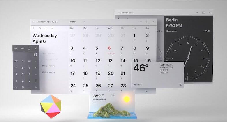
Many of us have grown accustomed to a “style tile” interface of Windows operating system. Metro was founded on the principles of the Swiss style. First of all, this is a great typography, large text, clean and framed in a simple square and rectangular shapes. The first operating system, in the style of Metro Windows 8 was released in 2012. But as it turned out, Microsoft plans to change the usual for many colored tiles to a completely new style called Fluent Design System.


Updated graphic style Fluent Design System was presented to the public during the second day of the exhibition Microsoft Build 2017. Previously the project was known under the code name Project Neon. Microsoft from time to time teased by the fact that plans to make drastic changes in the interface of Windows 10, but details we of course were never reported. To the present day. The first elements of the new visual systems will be introduced in Windows 10 in the fall, with the release of the Fall Update updates Creators. To change users will have to accustom gradually, so as not to arouse their anger. Because people are mostly conservative and reluctant to accept the change of something familiar.


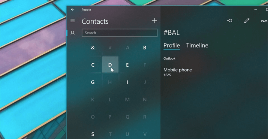
We invite you to see announcing Fluent Design System the video below. And also find several screenshots of the interface to study it in more detail. Microsoft claims that the system went light, image depth, motion design elements, the use of different materials, as well as the scalability of the interface to fit all screens and devices. It seems that the new interface will receive not only Windows 10, but applications for virtual and augmented reality. On some screenshots is the so-called “holographic interface” desktop. Well, it remains only to wait for the fall.


Microsoft has decided to abandon the interface in the Metro style
Sergey Grey